Bold Minimalism has become one of the most defining design trends of the past few years, and honestly, I think it’s one of the most misunderstood. People often assume minimalism means “simple” or “plain,” but Bold Minimalism proves the opposite. It’s about stripping away excess so that what remains has undeniable presence. Think oversized typography, confident negative space, and a limited color palette used with intention rather than caution.
What I love about this trend is how it balances clarity with personality. A bold minimalist layout forces every design decision to matter. If you choose a typeface, it needs to carry weight. If you introduce color, it needs to have purpose. There’s no hiding behind decorative elements or visual noise. The design either communicates or it doesn’t and that is pretty refreshing.
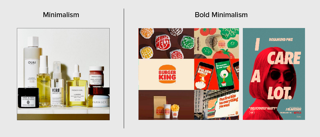
In my own work, I’m drawn to Bold Minimalism because it aligns with how people consume content today. We scroll fast, skim constantly, and make snap judgments. A bold, pared‑down composition can stop someone mid‑scroll because it feels intentional in a sea of clutter. It’s also a trend that adapts beautifully across mediums: branding, editorial layouts, packaging, and even UI design.
However, the real reason this trend resonates with me is that it reflects a shift in creative confidence. Designers are no longer afraid of empty space or quiet moments. Instead, we’re using them to amplify the message. Bold Minimalism isn’t about doing less, rather it’s about doing only what matters, and doing it with conviction.