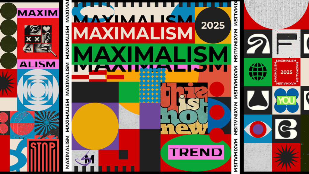
Maximalism and “chaos” layouts have risen back into the spotlight, and I think they’re one of the most exciting reactions to the overly polished digital world we’ve been living in. After years of clean grids, soft gradients, and safe compositions, designers are craving something that feels alive, expressive, and a little rebellious. Maximalism answers that craving with layered textures, clashing colors, dense typography, and layouts that intentionally break hierarchy.
What fascinates me about this trend is that the chaos is never actually chaotic. Good maximalist design is incredibly intentional. Every overlapping element, every unexpected type scale, every visual collision is placed with purpose. It’s a controlled mess, the kind that feels energetic rather than overwhelming.
I think this trend resonates because it mirrors the cultural moment we’re in. People are tired of perfection. They want authenticity, personality, and visual storytelling that feels human. Maximalism gives designers permission to be expressive again, to embrace visual abundance, and to create work that feels like it has a pulse. In my own design practice, I see maximalism as a creative playground. It challenges me to think beyond the grid, to experiment with rhythm and contrast, and to trust my instincts. It’s also a reminder that design doesn’t always need to be quiet to be effective. Sometimes the loudest, busiest, most unconventional layout is the one that communicates the strongest emotion. Maximalism isn’t replacing minimalism, it’s balancing it; I love that the industry now celebrates both ends of the spectrum.